
Ngoc Nguyen
SEO Engineer
Home > Insight > Technology
Map Projections: Mercator Vs The True Size of Each Country
5 minutes read
Audio description available
Mar 12, 2026
In the era of AI-powered digital maps and real-time geospatial data, one truth remains unchanged: every flat map is, in some sense, an artistic distortion of reality.
Even as we move through 2026 with breakthroughs in virtual reality mapping and intelligent GIS platforms, the Mercator projection—an innovation from the 16th century—continues to quietly shape how people perceive the world. Understanding the difference between projected maps and the true size of countries is becoming more important than ever, particularly in the context of modern geopolitics and climate change.
The Mercator Projection: Why Does It Still Exist in 2026?
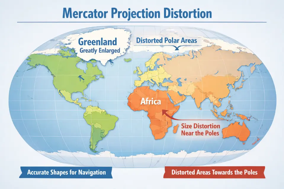
The Mercator projection, developed in 1569 by Gerardus Mercator, was originally designed for maritime navigation. Its defining feature is conformality—it preserves angles and local shapes, which makes compass-based navigation far easier.
Even in 2026, long after paper nautical charts and magnetic compasses ceased to dominate navigation, the Mercator projection remains the backbone of many web mapping platforms such as Google’s Google Maps and the mapping framework developed by Mapbox.
The reason is practical: Mercator maintains the correct shapes of streets, buildings, and intersections when users zoom in on a city map. This consistency makes it ideal for interactive navigation systems.
However, the trade-off is severe area distortion, particularly near the polar regions. As latitude increases, the projection dramatically inflates landmass size.
Read more: GIS mapping services for smart city development
The Surprising Truth About Real-World Sizes
In 2026—when global power dynamics between northern and southern regions continue to shift—accurately understanding geographic scale matters more than many people realize.
Greenland vs. Africa
On a Mercator map, Greenland appears comparable in size to Africa.
In reality, Africa is about 14 times larger. The entire landmass of Greenland could fit inside Algeria—Africa’s largest country—while still leaving substantial space remaining.
Europe vs. South America
Europe often appears massive on Mercator maps, yet South America is actually nearly twice the size of the entire European continent.
Russia and Canada
Russia and Canada are indeed vast countries. However, Mercator projections significantly exaggerate their size compared to equatorial countries such as Brazil and India.
Read more: Urban digital twin technology powered by GIS
Why This Matters in 2026
Geopolitics and Perception of Power
Maps are not merely tools for reference; they are instruments that shape perception. The Mercator projection visually amplifies northern countries while shrinking nations in the Global South.
In 2026, as new economic alliances emerge and global influence continues to diversify, having a fair visual representation of geographic scale helps analysts better understand resource distribution, population potential, and territorial context.
Climate Change
As polar ice melts and Arctic ecosystems transform, accurately visualizing the relative scale of polar regions compared to the rest of the planet becomes increasingly important for climate communication and policy planning.
Next-Generation GIS Technologies
Modern geospatial platforms now allow users to visualize geographic data in far more accurate ways. Tools like Atlas AI and The True Size enable interactive comparisons by letting users drag and overlay countries to see their actual scale relative to others.
We are no longer restricted to static, flat maps. Globe-based visualization has become standard across many mobile and web mapping systems.
Read more: Building interactive web maps with Leaflet
Modern Alternatives to Mercator
If accurate area representation is important in your geospatial visualization or GIS application, several modern projections are worth considering.
Mollweide or Gall–Peters Projections
These are equal-area projections, meaning they preserve the real size of landmasses. Continents may appear stretched vertically, but the proportional areas remain accurate.
Robinson Projection
The Robinson projection provides a balanced compromise between shape distortion and area distortion. It is widely used in educational atlases and thematic maps.
3D Globe Visualization
The most accurate representation is, of course, a globe. With the processing power of modern GPUs and mobile chipsets in 2026, smooth 3D globe rendering in web browsers is now practical and widely implemented in GIS platforms.
A globe eliminates the fundamental distortions that arise when projecting a spherical Earth onto a flat surface.
Top 10 World Map Projections
Different map projections serve different purposes, from navigation to data visualization. Here are 10 of the most widely used world map projections:
- Mercator projection – Popular for navigation but distorts size near the poles.
- Robinson projection – Balanced view, often used in world maps.
- Peters projection – Preserves area, shows true country sizes.
- Winkel Tripel projection – Used by National Geographic for accuracy.
- Mollweide projection – Good for global data distribution.
- Gall-Peters projection – Highlights size equality.
- Equirectangular projection – Simple but highly distorted.
- Goode’s Homolosine projection – Reduces distortion by splitting oceans.
- Azimuthal Equidistant projection – Shows accurate distances from a central point.
- Lambert Conformal Conic projection – Common for aeronautical maps.
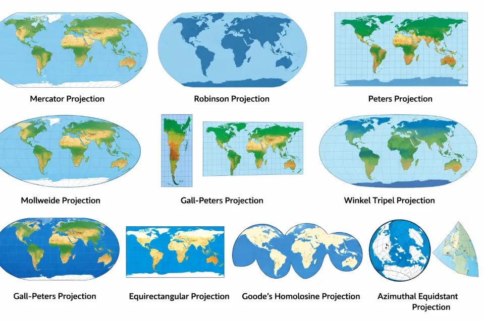
Each projection involves trade-offs between accuracy, shape, area, and distance—making it important to choose the right one for your specific use case.
Conclusion
Maps are the language of space. In a highly interconnected and rapidly changing world, using the right cartographic language helps us develop a more accurate and equitable understanding of our planet.
The Mercator projection remains useful for navigation and web mapping, but it should not define how we perceive the true scale of the world.
If you want to see just how different reality looks, try an interactive area-comparison tool and explore the true size of countries. The world is far larger—and more balanced—than the traditional Mercator map suggests.